
An Identity Refresher
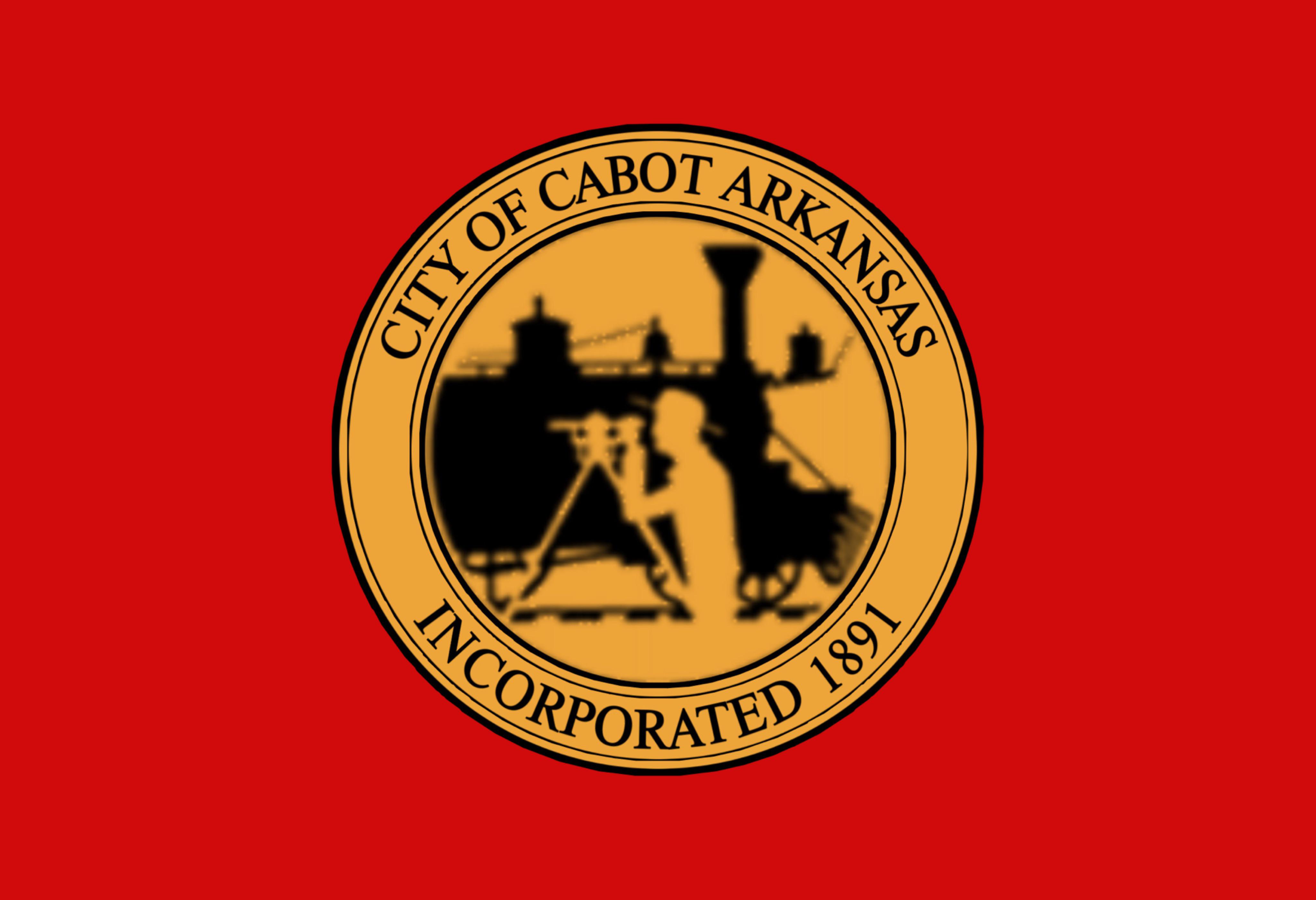
During my time at Thrive Inc, this project was a top priority. The old logo was busy and outdated-- relying on a railway theme that didn’t suit the city anymore.
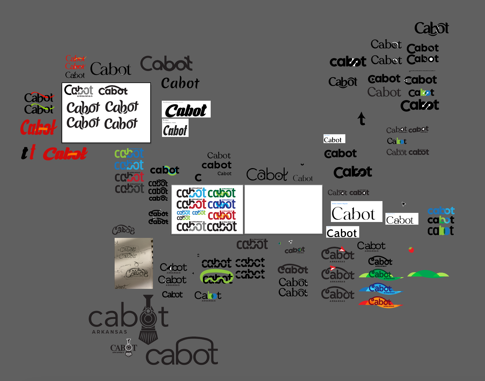
The updated logo should represent community and connectivity. It could also incorporate motion to reference their new bike trail.
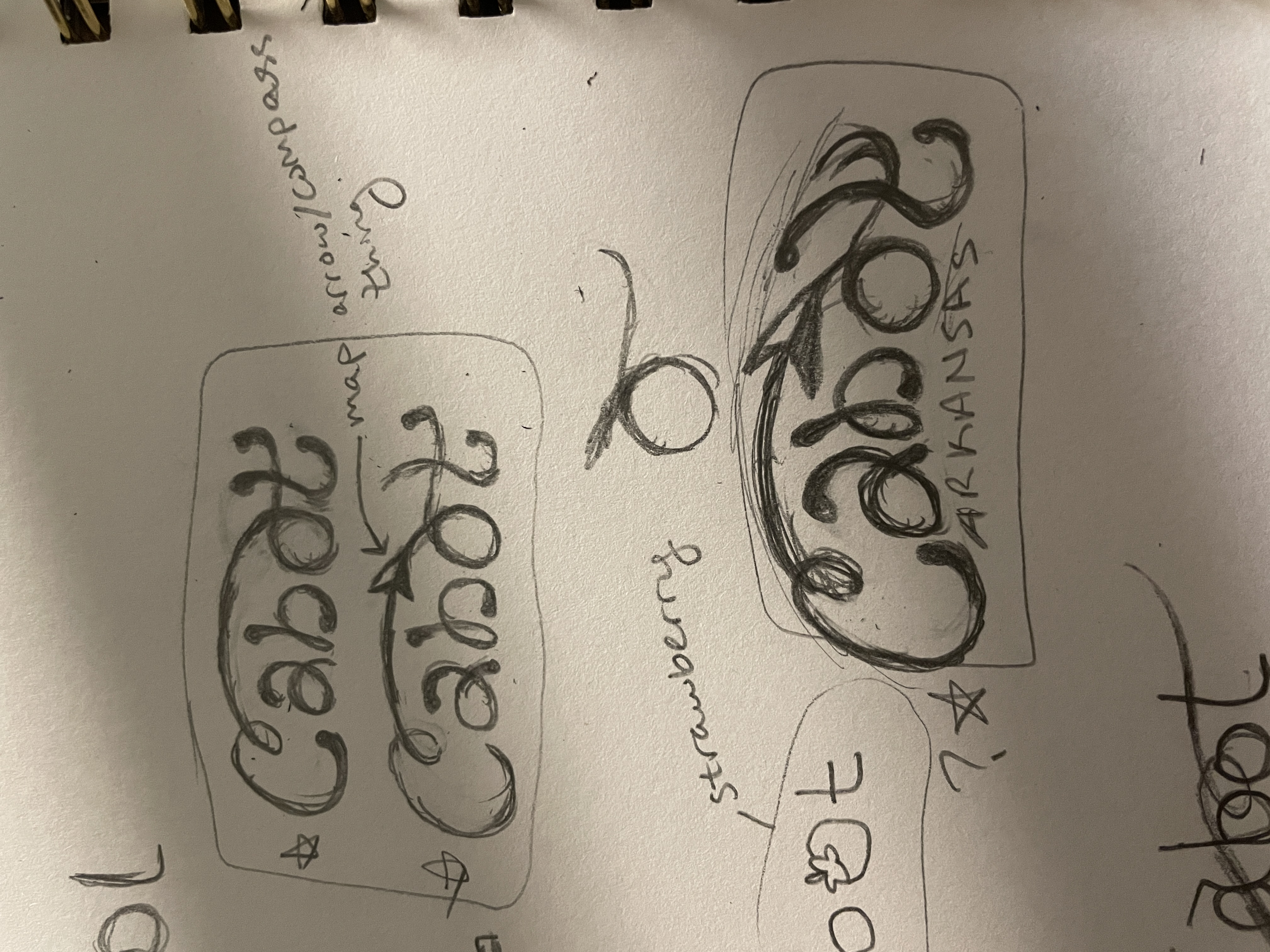
I was asked to develop my own ideas on this project as an intern, and came up with a few that ultimately weren’t selected but they were still enjoyable to draw up nonetheless.
A Connected Design
This design plays on the connection theme that the client requested. By attaching the letters, a sense of movement and flow is created throughout the workmark.
Color and Variety
Each color could represent different areas or departments in the city. Attention is also directed to the lighter-hued attachments with curving embellishments along the connections.

Cabot in the Hills
This design is based more upon the landscape and scenery rather than just the community aspect. It might feel too whimsical for a city logo, but I enjoyed the freedom I took into this design.
Filling in the Lines
Adding color blocks behind the wordmark in the shape of curves accentuate the connected arch.

