Refreshing the
Manic Panic brand
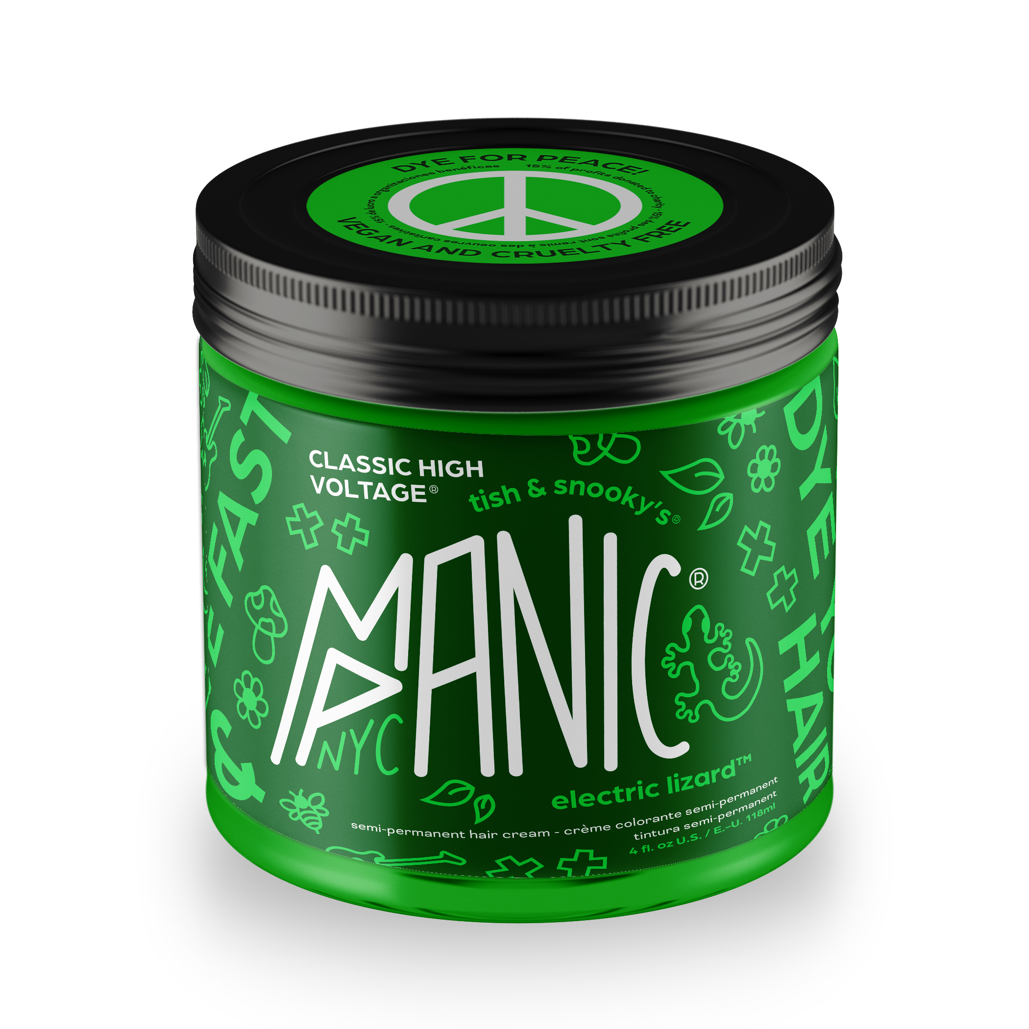
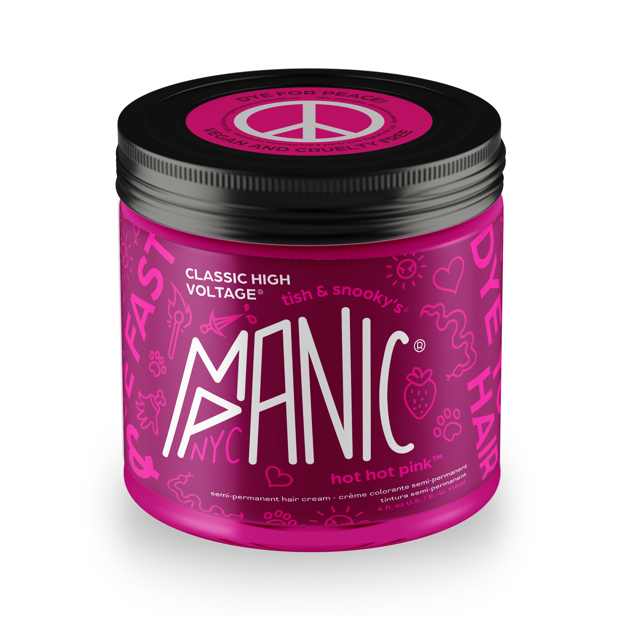
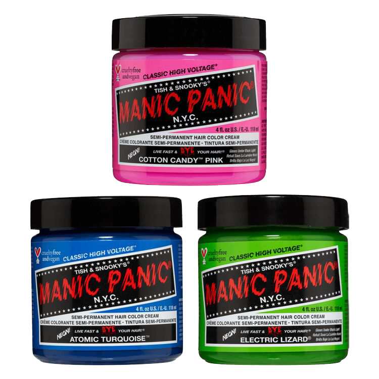
Manic Panic’s current branding is out of sync with the creative audience it is primarily geared towards. The identity doesn’t connect with creative and expressive users seeking to enhance their appearance with bold hair color.
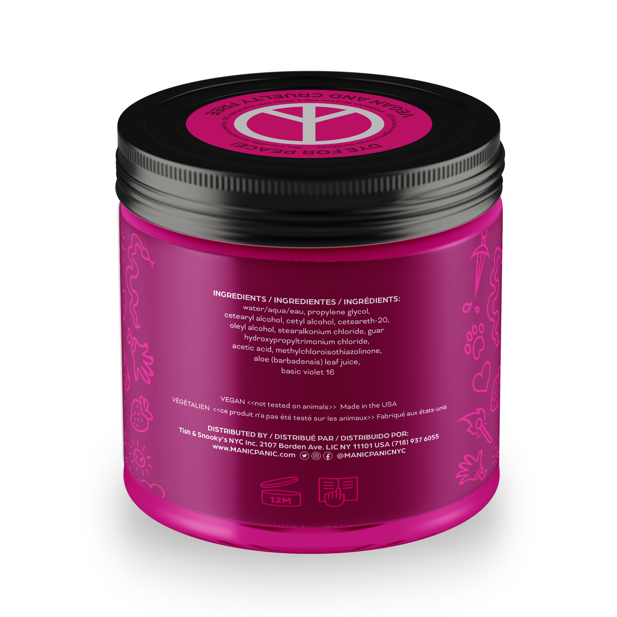
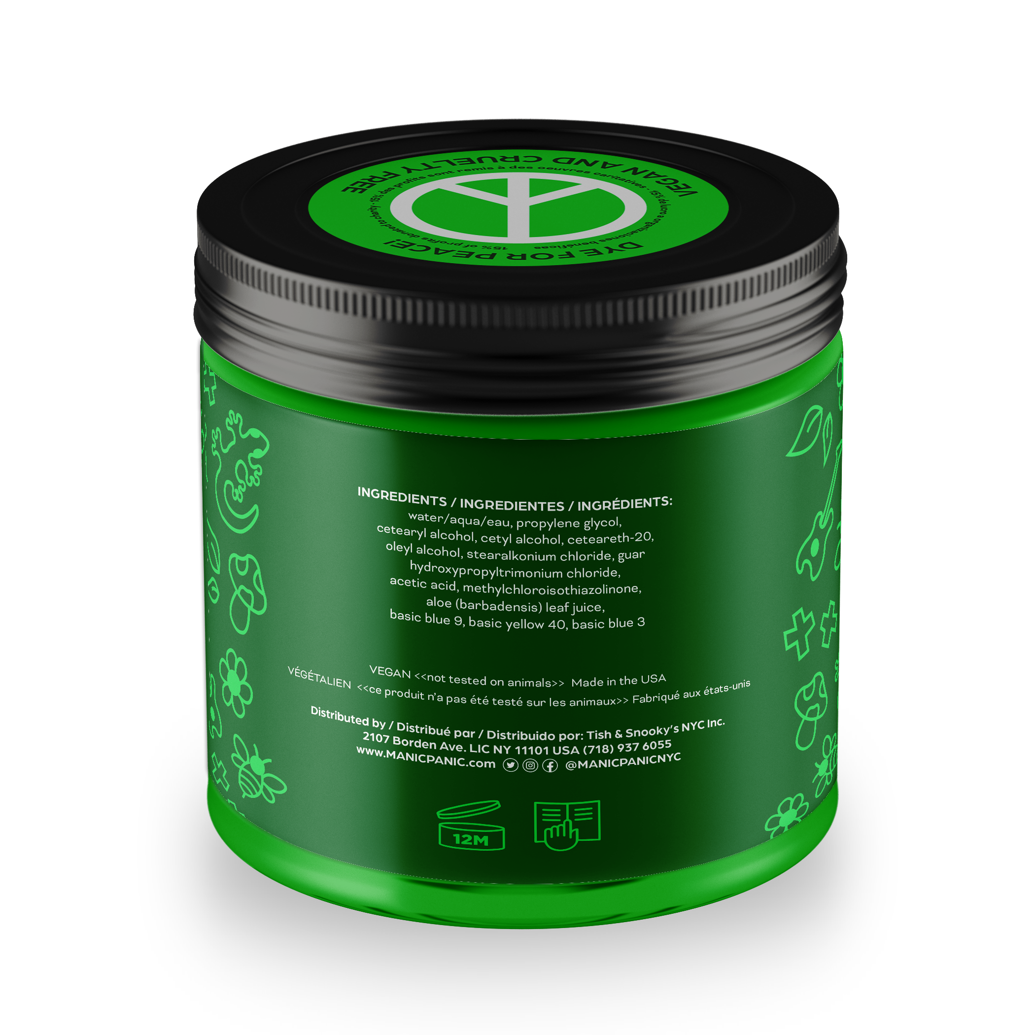
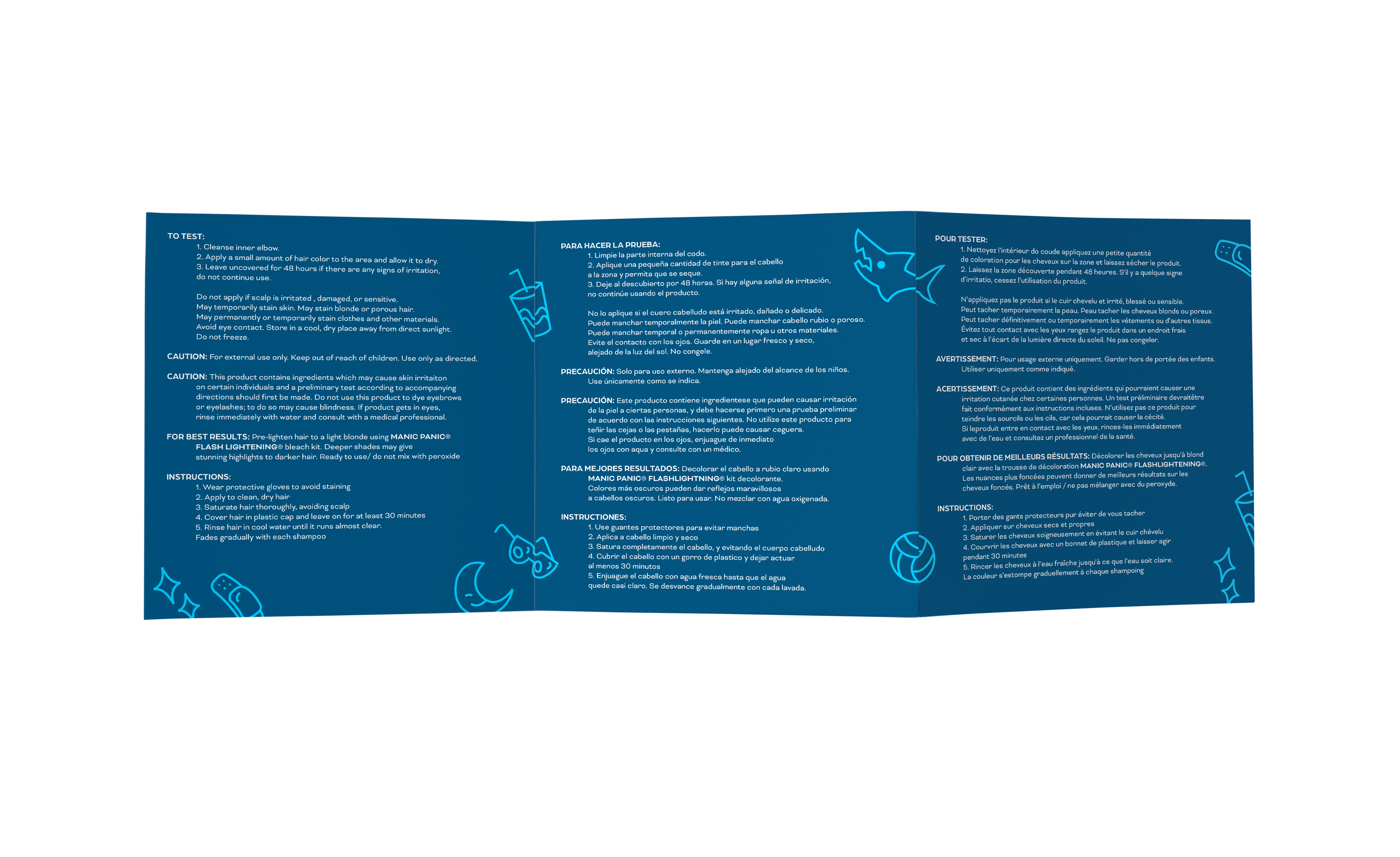
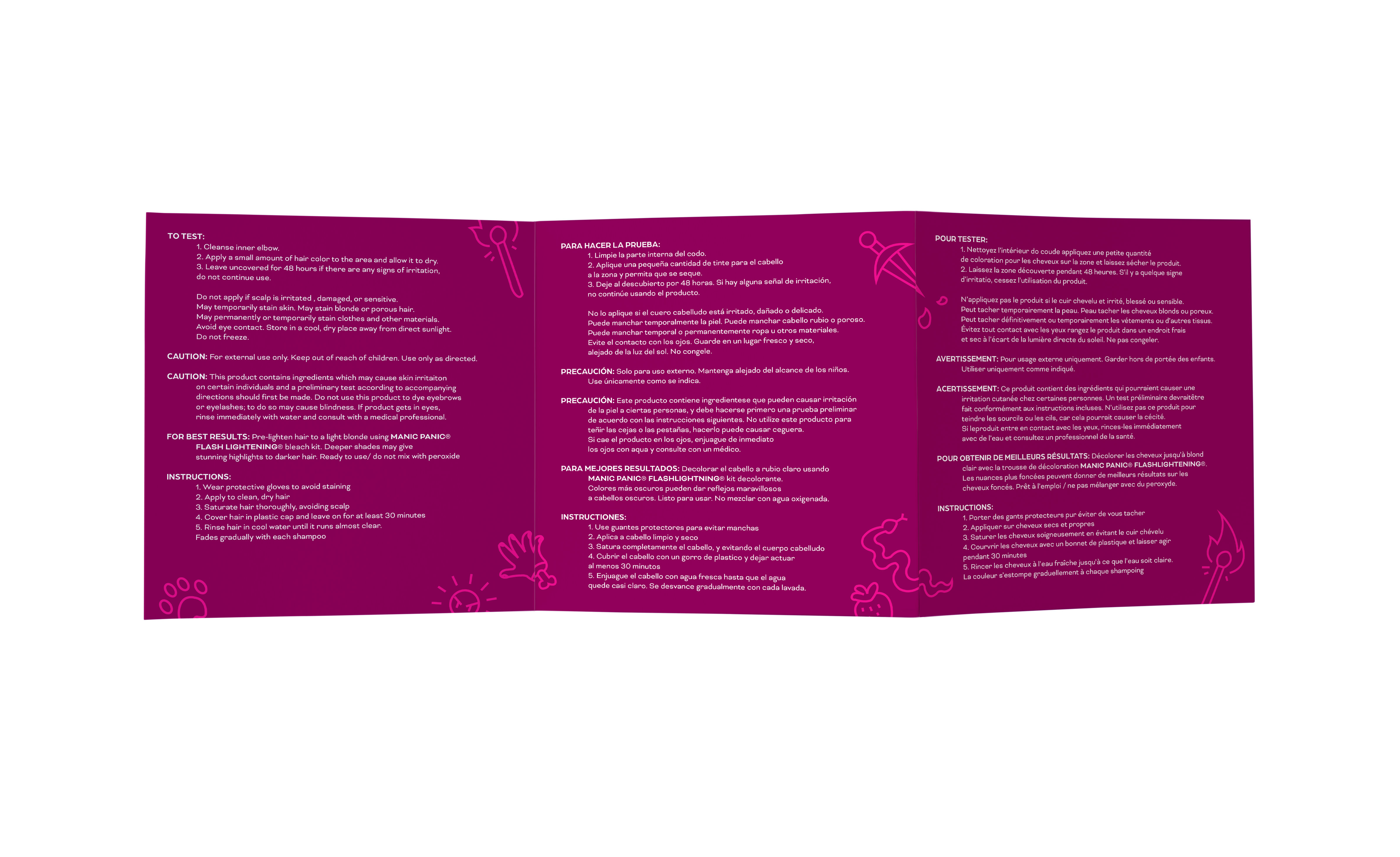
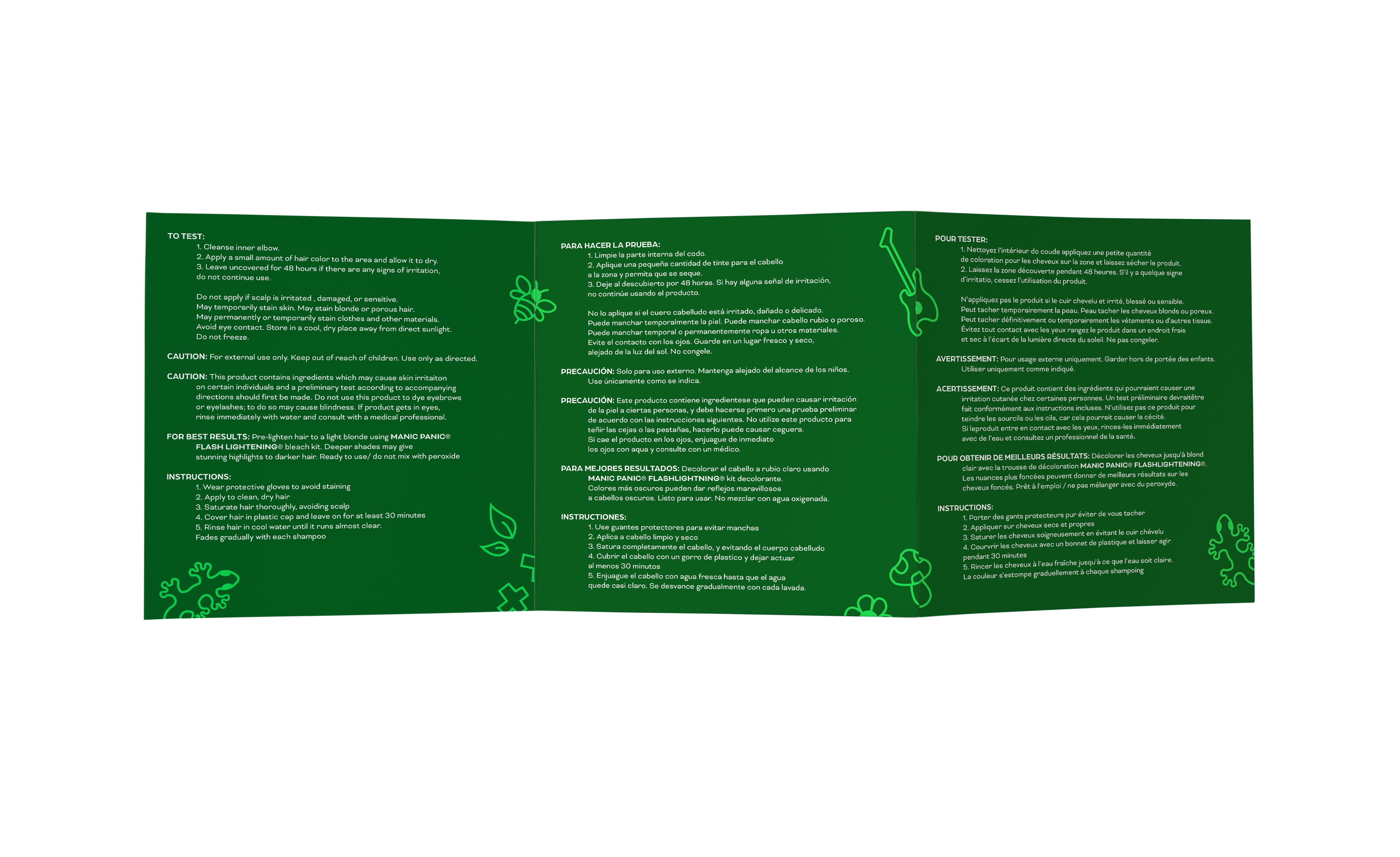
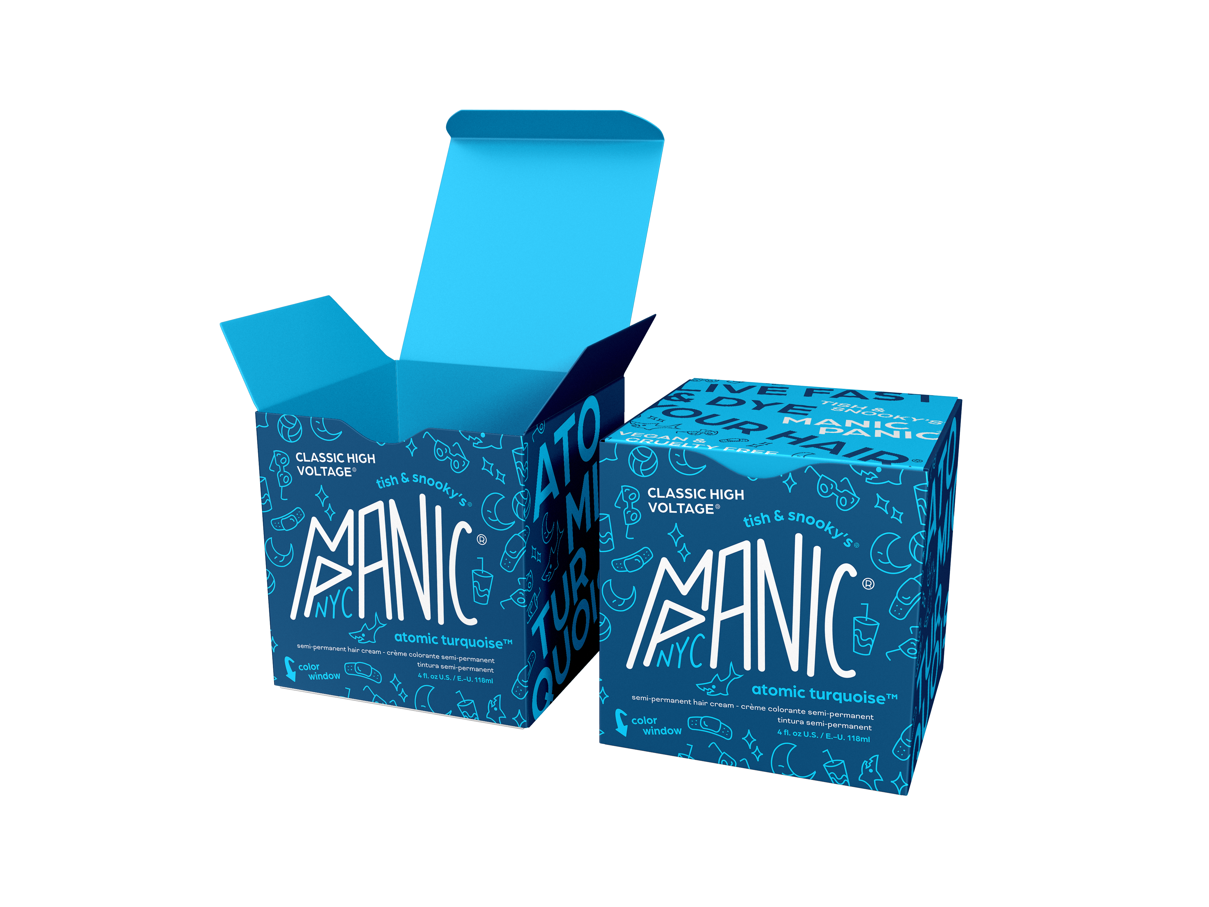
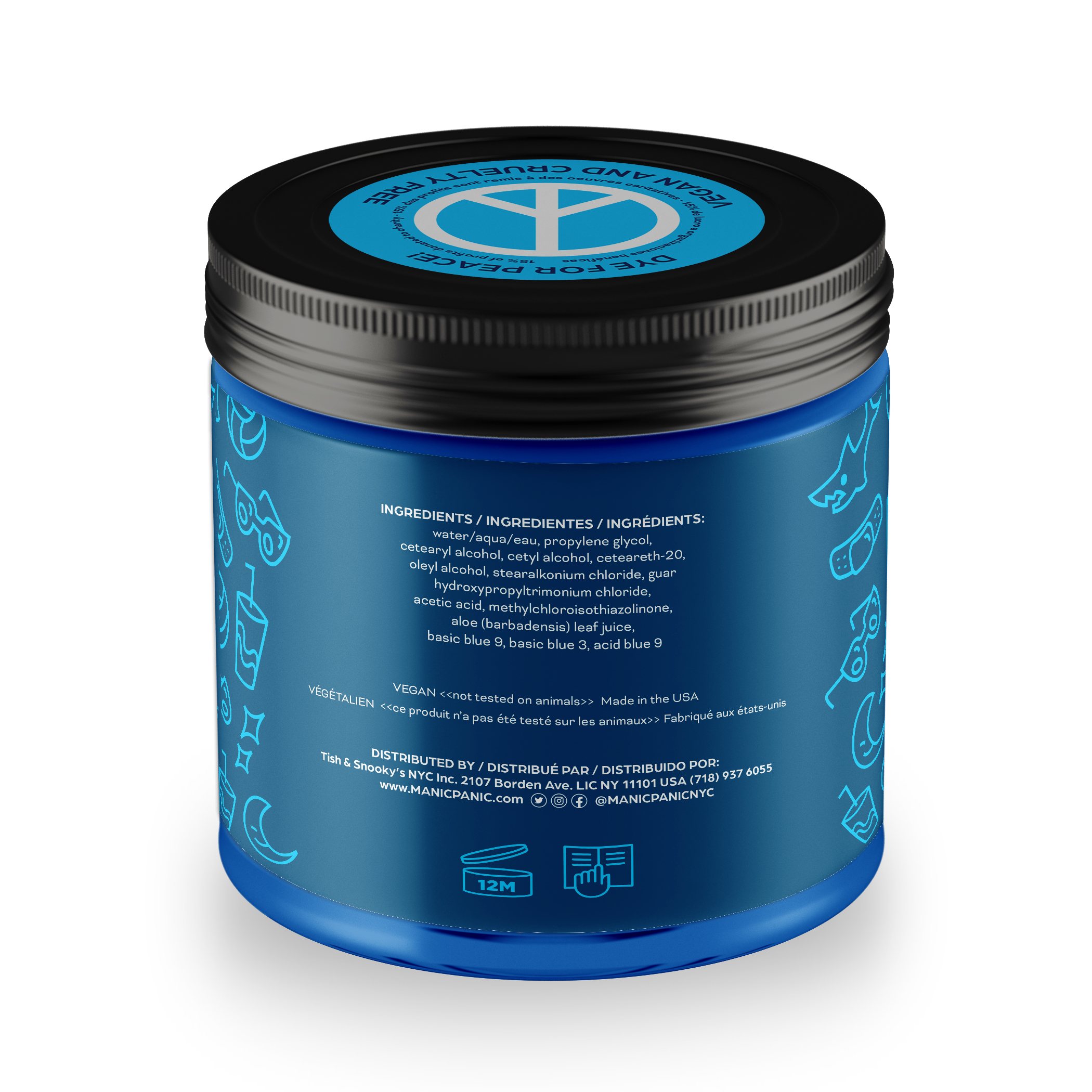
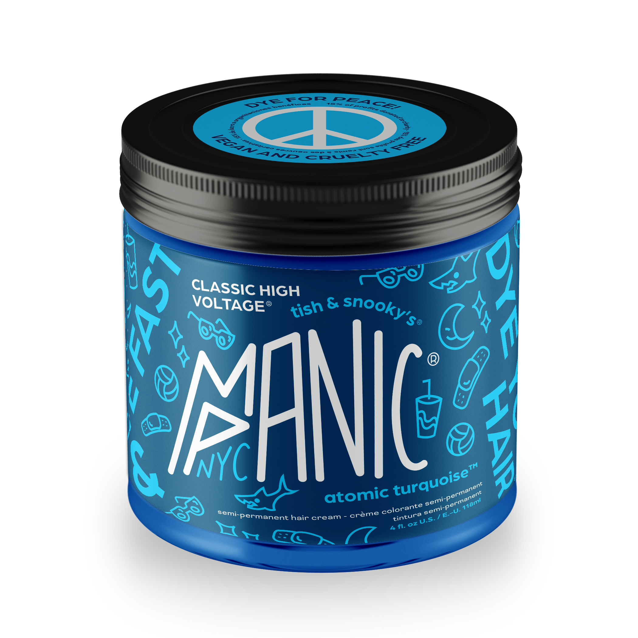
Additionally, the original packaging was only a small plastic jar with text crammed onto every surface, making information such as the instructions very compact and difficult to read.
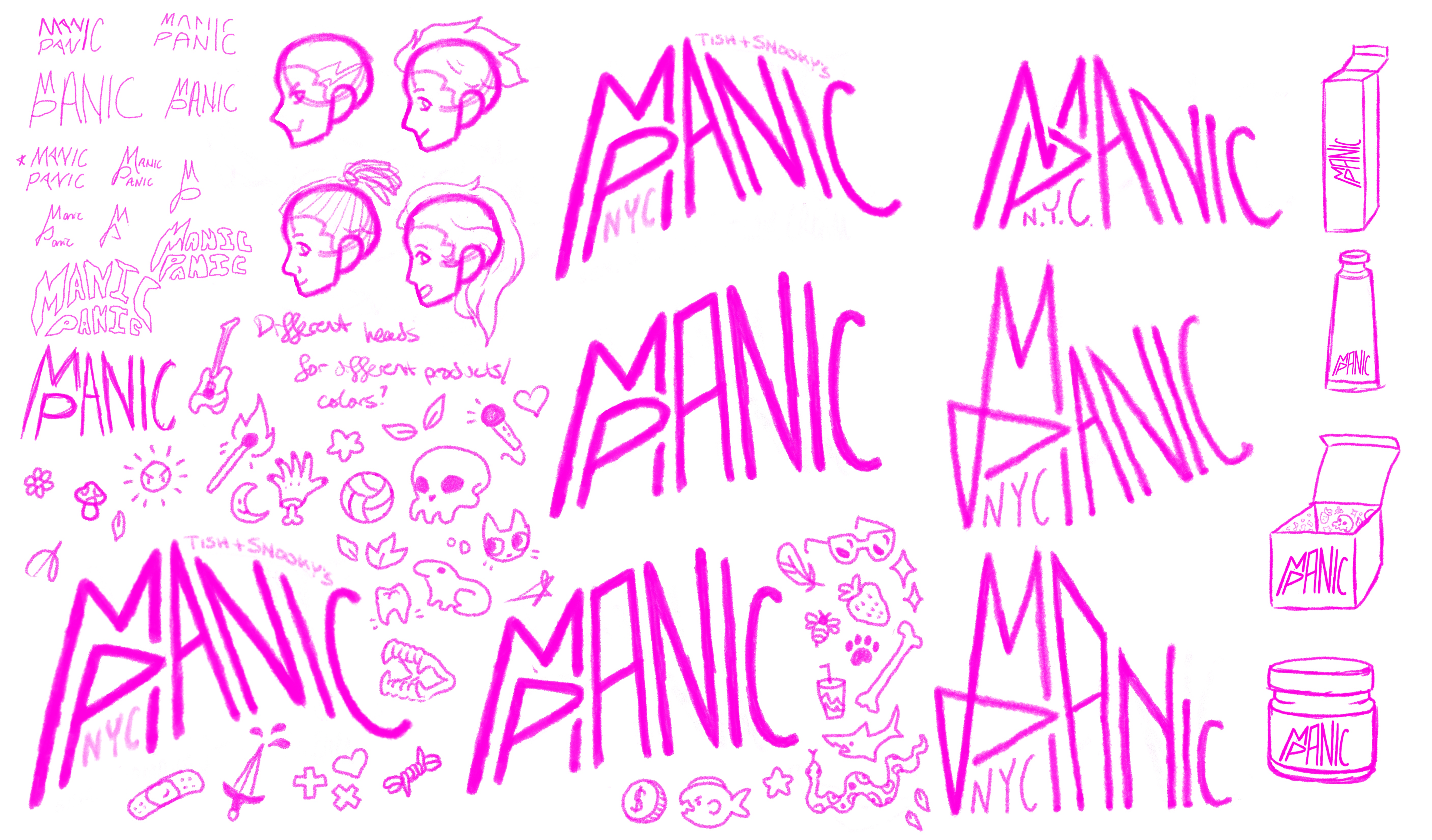
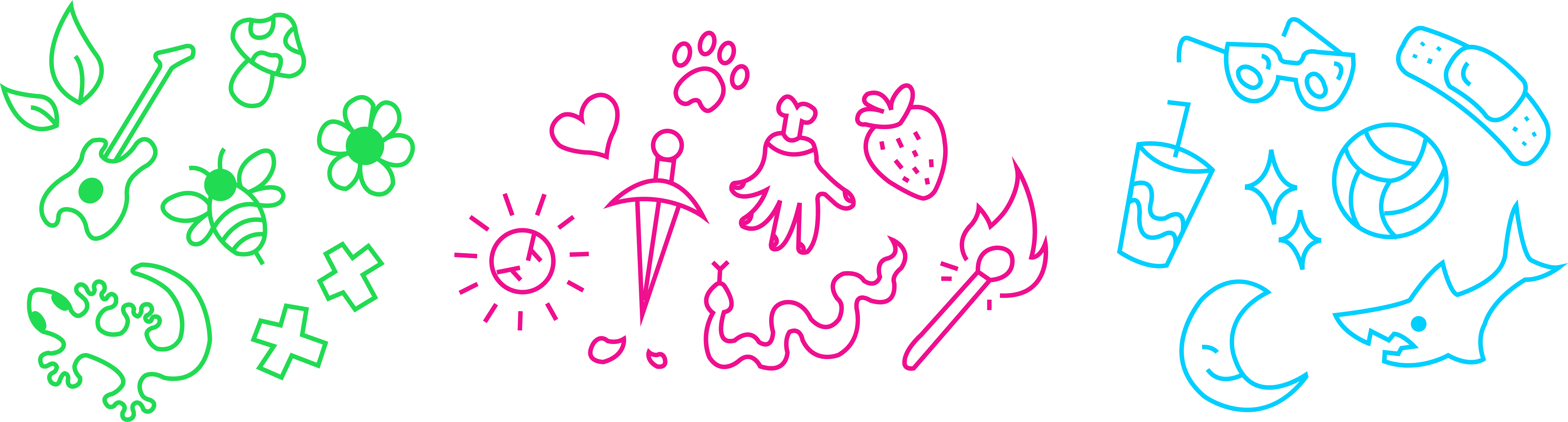
ILLUSTRATED ICONS
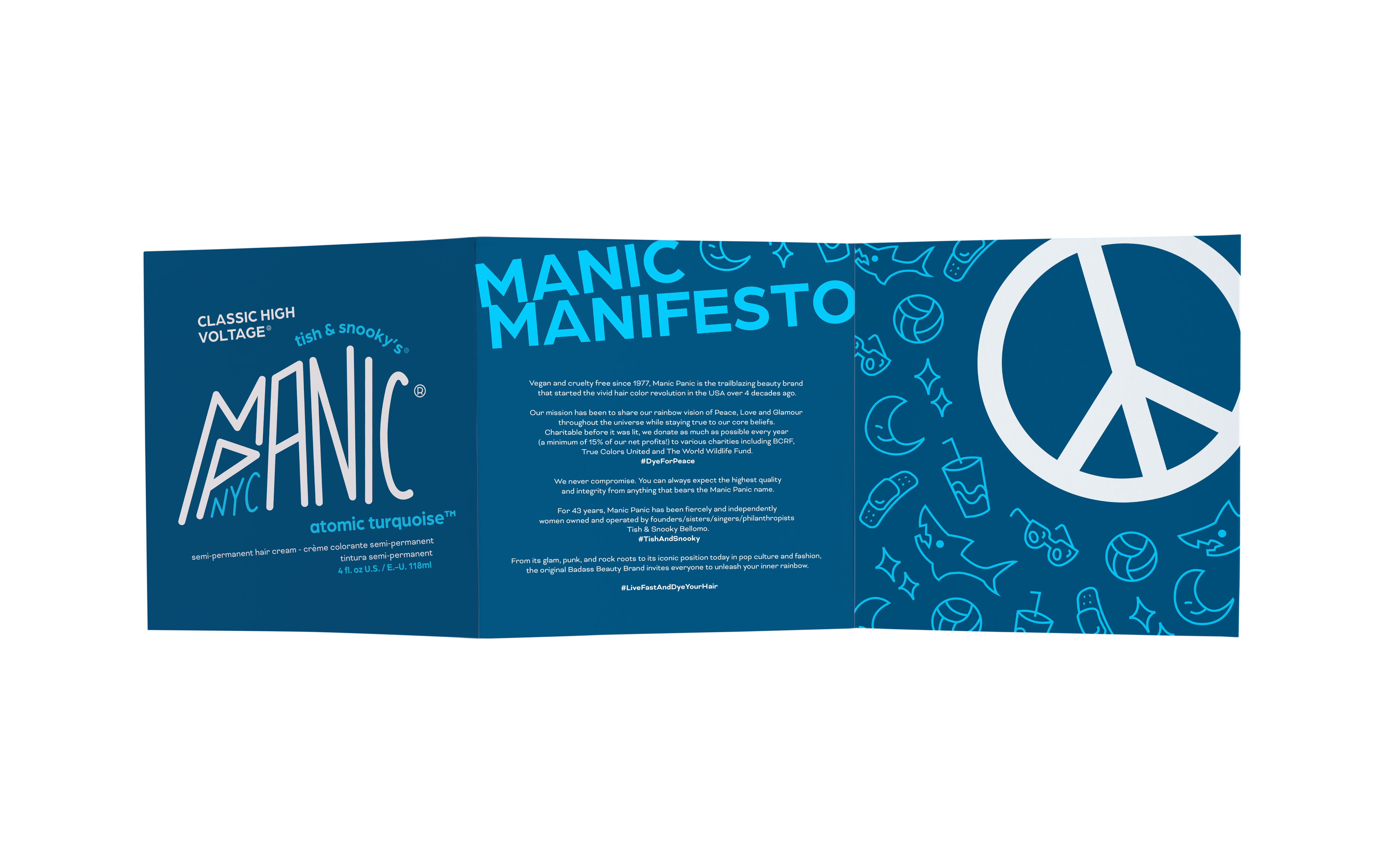
Information reworked to improve legibility
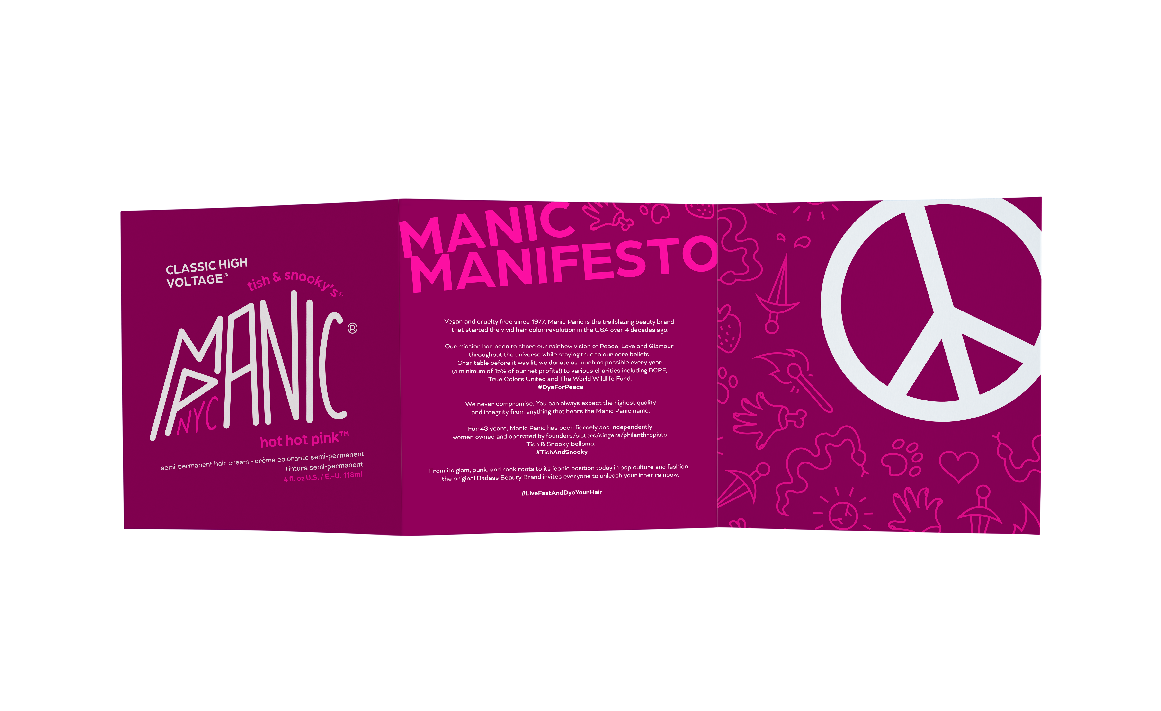
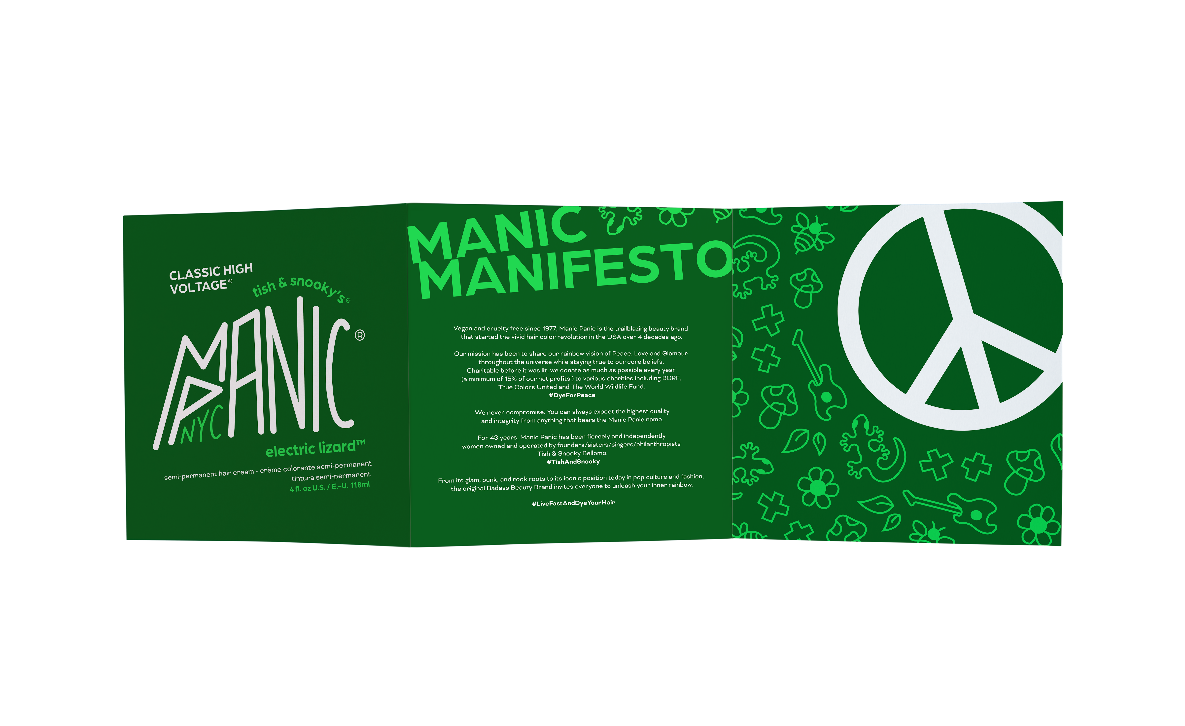
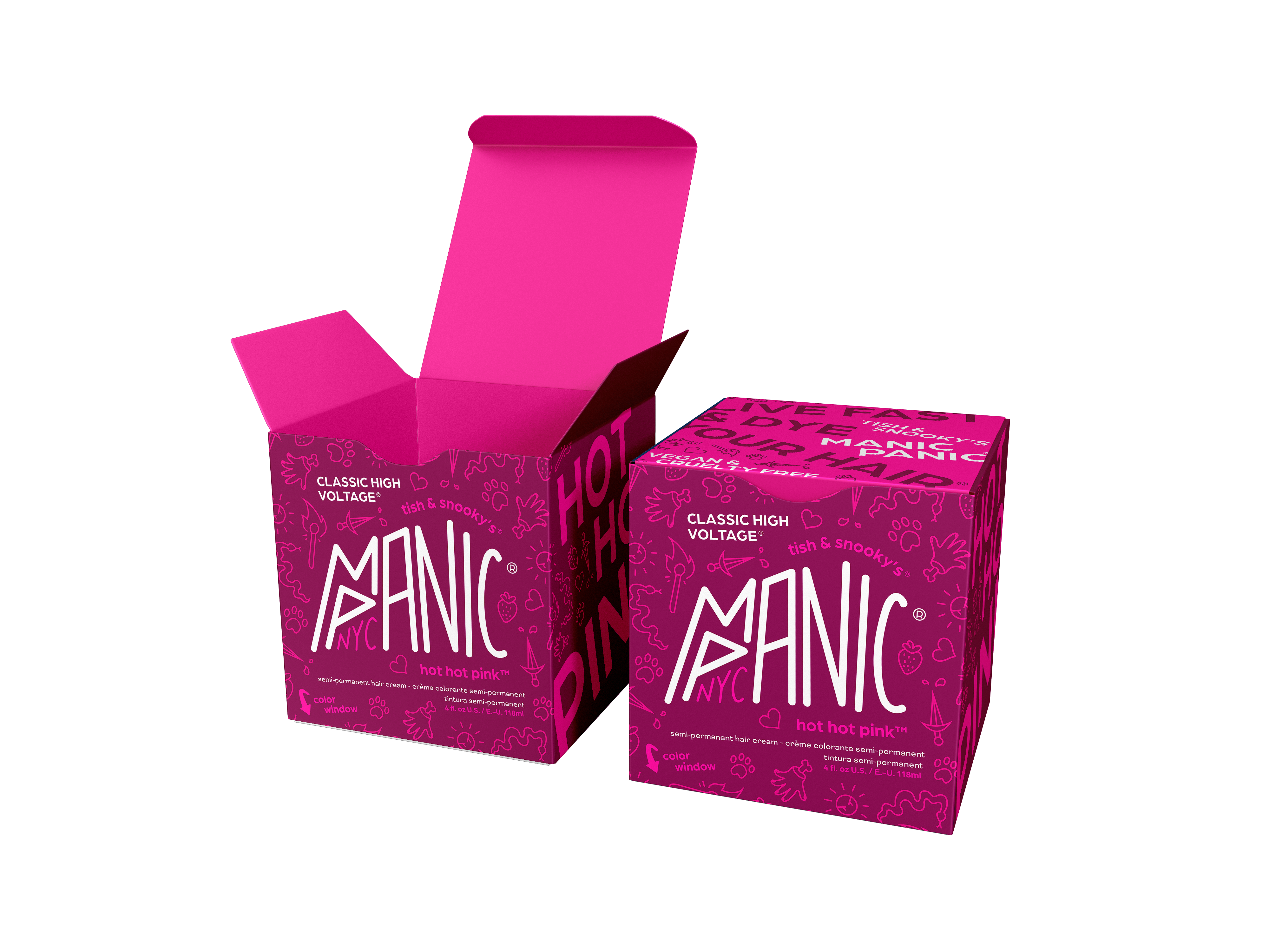
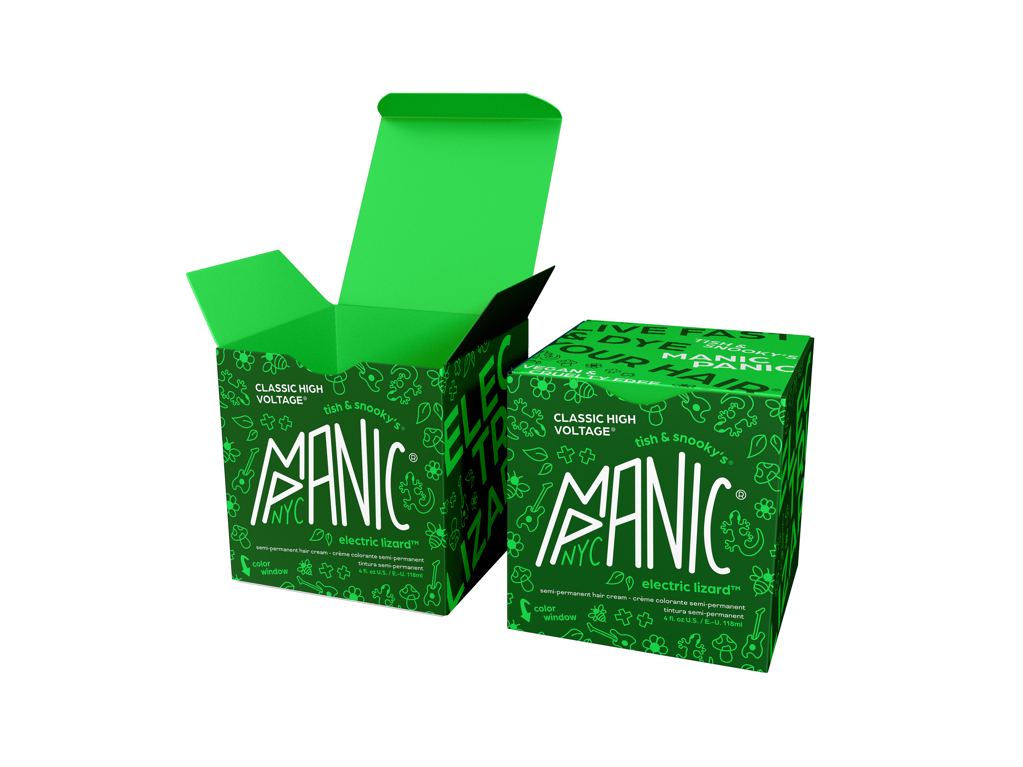
Originally, the box and instruction manual aren’t included in the original packaging but their addition gives the jar design more illustrative space.
By distributing the information among different packaging elements the legibility is improved.
By using a glass jar, cardboard box, and plastic-free paper instructions, each part of the packaging is recycleable.
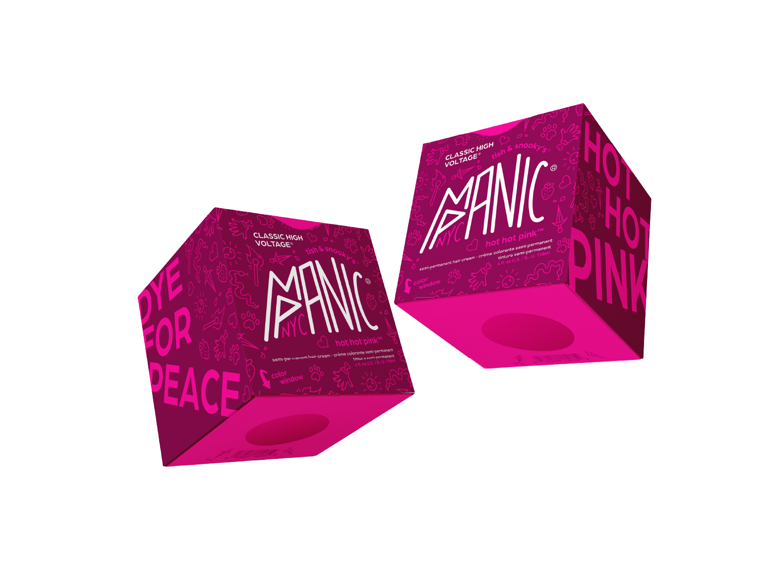
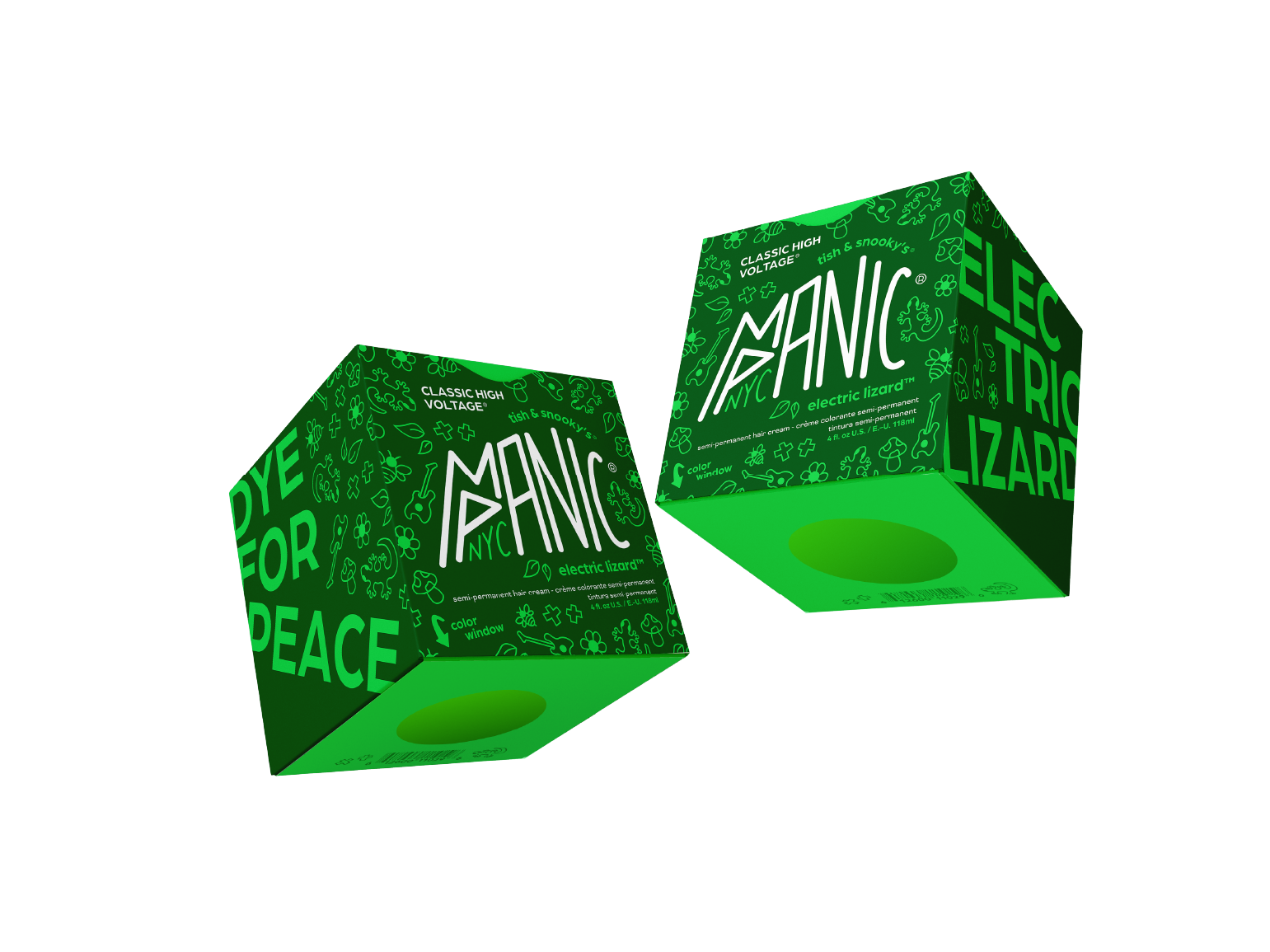
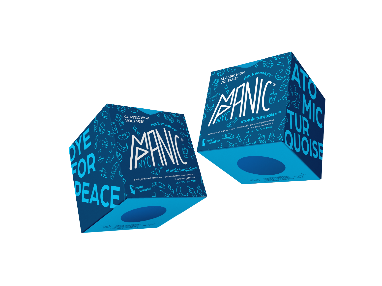
Color Window
A perk of the original packaging is being able to see the color of the dye through the plastic bottle, but with the addition of the box this is more difficult.
By cutting a small hole in the bottom of the box and creating a window, a user is able to see the color of the dye before purchasing so they might get a better idea of how the dye would look.

ORIGINAL VS ︎REFRESHED︎